Yssy's Media Blog
Introduction
My name is Ysabel Hudson Searle (candidate number 0331) and this is my Media Studies coursework blog, featuring my ongoing work. I am in Group 2, along with Harry Kettenis (0390), Matthew Romo (1660) and Joshua Stevens (0796). This is the link to our live facebook page: Group 2's Facebook Page.
You can use the labels down the side to navigate your way through my blog.
Thank you!
Sunday, 25 January 2015
Sunday, 4 January 2015
1) In What Ways Does Your Media Product Use, Develop or Challenge Forms and Conventions of Real Media Products?
We varied in our approach to conventions, we used conventions generally to uphold the audience expectations and audience familiarity as this can be crucial in audience gratification. However, we wanted in many instances to develop and challenge conventions for reasons expanded on in those particular cases.
The connection between the song and music video, theorised by Andrew Goodwin, played a prominent role in our decision-making in regards to whether we would use an illustrative, disjunctured, or amplifying approach to our video:
Additionally, themes of 'fire' and 'ice' appear in the lyrics, and we adopted this in our video through the use of the fire projection and water imagery for the ice. This plays into Goodwin's theories on the audience expecting and wanting to see contrasting images and binary opposites to keep them visually stimulated. Fire and water are just that, but also we used the vibrant fire shots to contrast with the darker shots.
The bright close-up on the stark white background compared to the dark rose close-up on a black background also follows this convention of contrasting images. We even made the make-up ad hair contrasting; the rose close-up has very matted make-up and big hair, whilst the 'wet look' has dewy, damp make-up and soaking wet hair. This was all to really stimulate the audience visually with contrasting, binary opposites in terms of the artist image too.
Genre:
Music Video Structure and Editing
Our music video contains performance, narrative and conceptual shots, which Simon Frith points out is conventional, although often not all three are combined. This makes for a recognisable and comfortable viewing experience for the audience, gratifying them with easy identification and familiarity.
The fact that we use all three sections equally develops this convention, as music videos usually use two, with one being more dominant. Below you can see how we divided our music video, in comparison to a referential music video - Rihanna's 'We Found Love':
Rihanna's music video followed Simon Frith's conventions of having a disproportionate division between narrative, performance and conceptual - and was Narrative-led. This contrasts to our music video, which wasn't largely dominated by either narrative, performance or concept.
The connection between the song and music video, theorised by Andrew Goodwin, played a prominent role in our decision-making in regards to whether we would use an illustrative, disjunctured, or amplifying approach to our video:
Amplifying:
We used the song and our interpretation of the lyrics to create our own story - for instance we took the lyrics and our interpretation of their meaning, and created the narrative of Roza's deteriorating relationship with her boyfriend. This gave the lyrics contextual meaning for the audience, especially important in a song which doesn't really pin-point the contextual meaning in the lyrics. We also used conceptual shots in this way, such as the back and dance shots, which show her emotions during the relationship.
Illustrative:
It was slightly difficult to use this as the lyrics and song can be interpreted in many contrasting ways. Once we decided on a solid interpretation, we used an illustrative approach with lots of the performance movement. For instance, Roza will physically act out the lyrics:
It was slightly difficult to use this as the lyrics and song can be interpreted in many contrasting ways. Once we decided on a solid interpretation, we used an illustrative approach with lots of the performance movement. For instance, Roza will physically act out the lyrics:
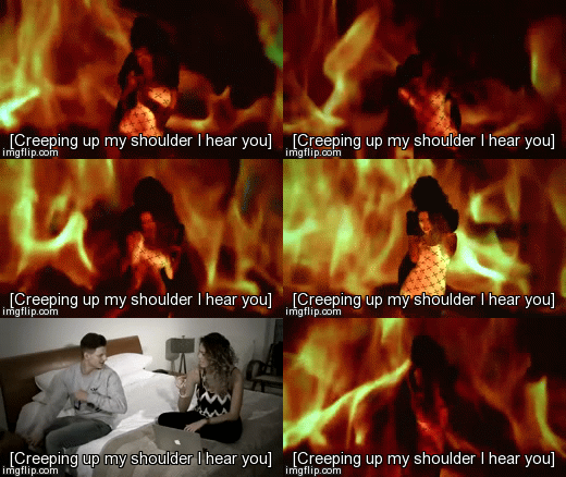 |
| Roza's arms 'creeping' up her 'shoulders' |
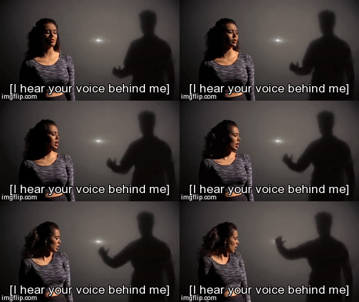 |
| Roza 'hearing' his voice 'behind her' |
 |
| Roza physically grabbing her 'head' |
Many real media products use this, for instance Miley Cyrus's 'Wrecking Ball' video in which she both literally comes in on a wrecking ball on the lyrics 'I came in like a wrecking ball', and also has imagery of broken walls when saying 'to break your walls'. The gifs below exemplify the use of this metaphor being illustrated visually:.
 |
 |
| Water shot |
The bright close-up on the stark white background compared to the dark rose close-up on a black background also follows this convention of contrasting images. We even made the make-up ad hair contrasting; the rose close-up has very matted make-up and big hair, whilst the 'wet look' has dewy, damp make-up and soaking wet hair. This was all to really stimulate the audience visually with contrasting, binary opposites in terms of the artist image too.
 |
| Dark roses close-up Bright 'wet look' close up |
Industry Expectations:
Some conventions are viewed as 'industry requirements': concepts that must be adhered to in order to present a recognisably professional music video, website and album digipak.
Goodwin identifies some of these 'visual hooks' needed, as close-up visuals of the artist, across all texts, which we used in order to establish our artist identity:
Audience Expectations:
Andrew Goodwin also identifies that audiences have expectations that we should cater to in order to gratify their needs. The list below shows some of these basic audience expectations and conventions within a music video:
Intertextuality
Richard Dyer's theory on the 'construction' of a star from 'real life material' was very enlightening, and so we used intertextual references to the British urban culture connoted through clothing:
Some conventions are viewed as 'industry requirements': concepts that must be adhered to in order to present a recognisably professional music video, website and album digipak.
Goodwin identifies some of these 'visual hooks' needed, as close-up visuals of the artist, across all texts, which we used in order to establish our artist identity:
 |
| Close-ups in the music video |
 |
| Close-up image used on the album |
| Close-up image used on the website |
'Re-occurring visuals across their work' are also an 'industry requirement' according to Goodwin, and we tried to cater to this by creating visual motifs for our artist, depicted in the second evaluation post, which can be accessed directly by clicking here.
Andrew Goodwin also identifies that audiences have expectations that we should cater to in order to gratify their needs. The list below shows some of these basic audience expectations and conventions within a music video:
- Believable lip sync - the audience need to believe that the singer and the song are in sync. We spent a lot of time on our in production and post-production syncing up the video lip-sync to the music. This standard is upheld across most professional music videos, for instance, Beyonce in 'Irreplaceable'. Emphasizing that the artist's lip sync so that it is clear can be done with lots of close-ups of the artist lip syncing. This is used in 'Irreplaceable', as it uses the close-up to establish this lip sync, then cuts out to continue the narrative story, which is done similarly in our video, as seen below:
 |
| Our 'Teen Spirit' with the lyrics |
- Movement - whether that be dancing, camera movement, artist movement, but stasis is unconventional and can bore audiences. We have dancing both from a dancer and the artist; movement within shots, like the artist throwing away roses (seen below), and camera movement within narrative shots like the one shown below. This convention was used in one of our main reference videos, Rihanna's 'We Found Love' (an example is show below also).
- Carol Vernallis adds to this by identifying the audiences expectation to see a master shot, usually a close-up, which used frequently. This is usually a performance shot of the artist. We used this convention by using the wet look and fire shots frequently - cutting in and out of narrative and conceptual shots with these master shots. The example below shows our music video jumping from concept shots of dancing, to (close-up performance) master shots:
An example of a real media product using this convention is in Rihanna and Drake's music video 'Take Care'. This video was puerilely conceptual shots and performance master shots, and below is an example of Drake's master shot (lip sync), cut in and out of conceptual shots.
 |
Richard Dyer's theory on the 'construction' of a star from 'real life material' was very enlightening, and so we used intertextual references to the British urban culture connoted through clothing:
Editing:
Carol Vernallis theorizes that editing is often done to the beat or the music and/or to musical or lyrical phrases. We had a strong beat to edit to in our music video, even though our pace is generally slow.
The video below shows how we applied this convention in our music video with our back shots, and then gives a real example from Rihanna's 'We Found Love':
This editing also illustrates our discontinuity within our editing editing. Vernallis also asserts the disruption of continuity in music videos as a convention, whilst Goodwin expands on this saying that music videos will deliberately uses jump cuts, disjointed edits, unexpected cutting & disrupted narrative flow to engage, entertain and convey meaning to the audience. We used this convention without exception in our music video, for instance with the shot below: jump cuts to illustrate to the audience Roza's devastation.
Jump cuts here are used to illustrate to the audience Roza's devastation, and to engage the audience in this troubling event.
We also cut in and out of narrative and performance shots to emphasise Roza's perspective and to draw the audience back to her reaction to the narrative. For instance, we cut between one club argument where Roza confronts her boyfriend for his cheating ways, and the fire performance shots where Roza is empowered, independent and angry: 'fiery'. Similarly, we cut between another argument between Roza and her boyfriend, and Roza angrily throwing away roses, the roses representing their relationship and romance. These cuts are used to show the audience what happened (the narrative ) and Roza's reaction to it (the performance and narrative).
- Focus on beauty, especially for females, with an emphasis on close-ups and 'beauty shots'. Goodwin explains it's source as the 'demands of the industry'/industry expectations. We used a conventional close-up with nothing to distract too much from the artist's face, hence the white background and static camera style. This is used in many real media products, especially with females, as even more emphasis on beauty is required for a female artist, a good example of this is Beyonce in 'If I Were a Boy'.
Beyonce in 'If I were A Boy's close-up
- Vouyeristic approach to the body particularly when it comes to females.
This, first developed by Laura Mulvey, argues that in a patriarchal society, the dominant position is that of the male. Therefore the camera lens adopts the male POV, and the audience accepts this POV regardless of their gender.
We both developed and challenged this. We wanted to conform to the industry demand of 'sex appeal' but challenged this genre's generic approach.
Firstly, by ensuring that in the 'sexier' shots we did not cut to any specific body part - which is conventionally uncommon, and kept her face in every shot. By doing that you lose some of the vouyeristic approach, especially as we made sure to have lots of close-ups and her face throughout as the main focus - seen in the fire shots below, where she is dancing seductively, but their is no focus on a particular body part, and we cut to close-ups, bringing the focus back to her face.
 |
We also begun and ended the music video with a close-up of her face, not only to establish a strong artist identity, but to keep this focus on her face to deter any sort of objectification:
Beginning shot:
Ending shot:
We definitely wanted to show sex appeal, but by keeping the focus on her face, and so her as a person. In the main performance sequence - the 'wet look' sequence, she looks like she's just gotten out of the shower or pool (and so consequently naked) which is commonly used within the genre to sexualise and objectify the artist:
Rihanna's wet look in 'Stay' featuring lots of vouyeristic shots; lots of close-ups and panning upwards of body parts e.g. lips, mid-rift, and a focus on the artist's naked body.
Roza's 'wet look' using the camera framing to focus on her face and stays on her face - developing upon the sexualized wet look.
We also challenged this within the digipak, by having less focus on the body throughout. Whilst the front cover of the album shows her body, the image is not provocative or sexualised, which can be common particularly in this genre. This is also partly to do with the fact that a large proportion of our audience would be female, and if a larger proportion was male we may have taken a different approach to attract our audience.

The body does feature on the front cover, but the focus on the cover is the rose and the art's face.
Again, Roza's body is on the digipak, however in no tight or revealing clothing which would highlight her body and sexualize it, in fact the opposite is done as it is generally hidden by the big baggy jacket. This draws attention to her face, hair and the boom box. This particularly challenges Paul Messaris' theory that 'female models addressed to women seem to imply a male point of view' - as our target audience is largely female, yet we do not adopt this 'male gaze'/POV.
- Themes of emotion and romance are common with both male and female artists within the genre. Therefore there are lots of close-ups and mid-shots revealing the artist's emotions.
Jhene Aiko in her music video illustrating her 'frustrated' emotions through her lip-sync and expression
Roza illustrating and amplifying the lyrics by showing her angry and embittered emotions through her close-up expression.
- Particularly within the R&B genre there is a focus on material wealth as a genre signifier in music videos, and a focus on showing that power off. In the PBR&B genre this is less prevalent but still apparent.
 |
We challenged this by having no focus on material wealth. Even the costume was planned on the basis that we wanted to show a middle-class female artist, rather than a millionaire celebrity. We depicted this through our costume and set:
 |
| Roza's performance costumes - not extravagant or signifying particular affluence. |
 |
| Costume in narrative shots, again, not particularly extravagant or showing exceptional wealth. |
- Particularly in the PBR&B genre there is a focus on activities like partying, taking drugs and sex.
Rihanna's 'We Found Love' - drugs, partying, sex etc.
We only have one club scene which could use, if not develop this. We chose not to show these activities as we wanted our artist to be a positive role model. We did show her clubbing and dancing which is conventional for her genre and identity, but developed the convention above by making them have a good time without such negative influences e.g. drugs, as seen below:
 |
| They are dancing and smiling, but no drinks of drugs are seen, whilst the lighting and attire suggests a club setting. |
- Conventionally, music videos within this genre encompass some sort of dance, whether it be break dancing, contemporary or seductive and sexual. We took inspiration from FKA Twigs' dancing in her music videos, which develops the conventions of contemporary dance and urban dance in music videos.
 |
| Our dance footage |
 |
| Jhene Aiko |
 |
| FKA Twigs |
 |
| Tinashe |
We were wary because we wanted to present a female in control of her sexuality, one that is not sexualised and objectified, yet still able to freely express herself. Barthes suggests that clothes sexualise women, and we challenged this in our representation of our artist Roza. Below this is evident in our depiction of her on her website through publicity shots:
 |
| Publicity shots on the website |
 |
| Publicity shots on the website |
 |
| Publicity shots on the website |
As you can see from many of these artist images, we did not use her clothing to particularly sexualise her, but allowed some sort of free expression. Whilst we din't want to objectify her, we still needed to present her as someone recognisably of her time, age, and genre.
We needed this as we needed our artist to reach and attract large audiences, through the conventional way which Richard Dyer calls the creation of a star. Dyer states that 'celebrities' are constructed personas made for finical gain and targeting specific audiences.
So we needed to balance out conforming conventions with challenging them - which ultimately led to developing these conventions. We developed them in the sense that we tried to present a star who still has sexual expression and can be recognisable to our target audience, which is largely young females; but does not conform to the over-sexualization and vouyerism that often comes with that.
Dancing is conventionally used in R&B music videos to sexualise the artist or person dancing. Throughout our music video we have dancing, a genre signifier itself which we adhere to. Male artists tend to go within the urban/street dance style, while female artists within the R&B genre tend to dance in a much more sexualised way. Commonly, for prime time TV slots they will conform to keeping the dancing moderately sexual, with examples of Beyonce shown below:
Her dancing centres around moving her hips, and is seductive, but still conventionally acceptable for prime time TV viewings:
 |
| Beyonce in 'Soldier' 2004 |
 |
| Beyonce in 'Beautiful Liar' 2007 |
 |
| Beyonce in 'Drunk in Love' 2014 |
We chose for our artist to use this convention, and so we had her dancing in the club and fire scene in a very similar style.
Album Digipak
Whilst not conforming to a voyeuristic approach to our digipak, we did want to use some conventions of our genre. In this respect, we looked at Ariana Grande's 'My Everything' album digipak.
Whilst not conforming to a voyeuristic approach to our digipak, we did want to use some conventions of our genre. In this respect, we looked at Ariana Grande's 'My Everything' album digipak.
Website Conventions
With the technologically converged world of the web 2.0, websites are conventionally a place for the audience to learn about the artist and their products, purchase, interact and share what they enjoyed.
Landing page:
We chose to have a landing page as it is a convention within our PBR&B genre and a good way to promote artist's new products. As you can see below, the artist's within our PBR&B genre all use it to promote things like their new music video, new single or new album.
Landing page:
We chose to have a landing page as it is a convention within our PBR&B genre and a good way to promote artist's new products. As you can see below, the artist's within our PBR&B genre all use it to promote things like their new music video, new single or new album.
 |
| Our artist landing page promoting her new album. |
 |
| The Weeknd promoting his new music video on his landing page. |
 |
| Jhene Aiko promoting her new album on her landing page. |
 |
| Tinashe promoting her new album on her landing page. |
The landing page itself encourages right from the onset interactivity, as you have to click to enter the site. We also encourage audience participation through competitions such as the one below:
This was challenging conventions of the PBR&B and even R&B genre, as we found little to no examples of artists doing competitions like this. This was more prominent in the pop or rock genre.
Social media:
We recognized social media as an absolute must-have. With the climate of social media in the modern world, and with our audiences being largely young and/or regular users of social media, we had to ensure we were taking advantage of our audience's potential to share this information. We did this by having 'Like', 'Share' and 'Follow' buttons available in various places on the website, and also and a mailing list for updates. This was a common convention within our genre and across a broad range of genres, but we mainly took inspiration from artists within our genre:
 |
| Our social media links to the corresponding pages |
| The Weeknd's social media links directing you to their page on the social media website |
 |
| Tinashe's social media links and mailing list subscription |
 | ||
Our mailing list subscription bar
The header is usually the artist's name in their own distinct logo, to really establish this recognisable artist identity. |
 |
| The Weeknd's header with signature font and colours |
 |
| Our header with the signature 'Roza' sign/font and iconographic smoke and colouring |
Footer:
The footers tend to be where institutional information is, details on copyright and record labels. Often they are also where you find many social media links and subscriptions to the mailing list; we used this convention to ensure our website looked professional with all of the correct legal information, but also was a familiar place to find things like social media links and subscription areas - which the audience would expect.
 |
| Jhene Aiko's footer |
 |
| Our footer |
Homepage:
The homepage usually is a page dedicated to recent events or activities for the artist; for instance we have the new album emphasized. The homepage is conventionally the first thing that comes up, and so it needs to generate interest straight away.
 |
The artist image needs to be consistently promoted through the website, and we used this convention to aid the branding of our artist, taking inspiration from Tinashe's website and her use of the homepage, photos and videos to promote a consistent artist image/brand.
 |
| Tinashe's homepage with consistent artist images |
 |
| Our home page with consistent artist images |
 |
| Consistent artist images on the website |
 |
| Consistent artist images on the website |
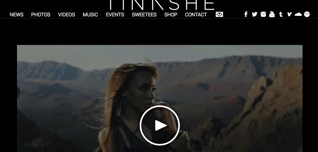 |
| Artist image promoted through image on website |
 |
| Artist image promoted through music video on website |
Sound
As well as visuals, we also incorporated the convention of sound into our website through the use of Sound Cloud embedded within the website.
 |
| Jhene Aiko's sound cloud playlist of songs |
 |
| Our sound cloud playlist with Roza's song |
Press:
The use of text in the form of press is also conventional and helps to promote a particular identity for the artist, which contributes to the artist's image. The website can therefore use press to help reiterate this image and encourage and intrigue the audience with learning opportunities.
 |
| Tinashe's homepage with photos and articles about her |
 |
| Jhene Aiko's 'Press' page with articles about her |
 |
| Our artist press - articles which you can tweet and share on Facebook |
Purchasing opportunities:
They are a vital source of income for the artist, and to make these purchasing opportunities as appealing as possible we made sure to have a variety of products and options of those products. This was something we saw lacking in some artist's websites, like Jhene Aiko, who had little product variation, perhaps not needing the income. As our artist was a debut artist we wanted to make sure as many income opportunities as possible were used to their fullest capacity. Conventionally, even artist's who don't necessarily need the money, will still have merchandise to allow fans to show their support for an artist through things like clothing or jewelry - which also helps promote the artist.
 |
| A variety of colours and sizes to chose from |
 |
| A variety of products to chose from; signed posters, albums (hard and digital), and clothing and accessories. |
 |
| Jhene Aiko's scarse purchase opportunities |
Subscribe to:
Comments (Atom)


