Introduction

My name is Ysabel Hudson Searle (candidate number 0331) and this is my Media Studies coursework blog, featuring my ongoing work. I am in Group 2, along with Harry Kettenis (0390), Matthew Romo (1660) and Joshua Stevens (0796). This is the link to our live facebook page: Group 2's Facebook Page.
You can use the labels down the side to navigate your way through my blog.
Thank you!

Music Video

Our Music Video:

Group 2 Website

Our Website - Click to enter.


Our Album Digipak

Our Album Digipak
Our Album Digipak

Thursday, 18 December 2014

Grading our Music Video

Below is a version of our entire finished music video, with the ungraded half of the shot on the right, and the graded shot on the left:
 
As you can see, many shots were heavily graded, like the wet look shot and the silhouette shot, and many were only tweaked, like the club scene and the fire shots.

Black & White:
Graded                                Ungraded 


This was used to make the back shot black and white - more artistic and dramatic, fitting the whole concept. This was a preset already in Premiere Pro, and simply had to be applied to the footage.


ProcAmp and the Colour Corrector:
                     
ProcAmp and the Colour Corrector                              

This was used widely across our shots, as it allowed us to adjust colours and the brightness and contrast of shots, which often needed to be tweaked. This can be exemplified most prominently in these shots:

Graded                   Ungraded


The rose shot needed to be brightened slightly, and have a less orange, less saturated look. This shot was meant to show Roza's cold, bitter side, and so we wanted a cold feel to the shot, hence de-saturating it and making it a cooler tone.


Graded                    Ungraded


 The wet look shot needed a less red tint, making the background look whiter. My skin also needed to be brighter, which would enhance the 'wet look' as higher contrast would make the water stand out more.


Graded                           Ungraded
The dance shot was to be in black and white, but we found that actually using ProcAmp to desaturate the image worked better than the black and white effect available on Premiere Pro.


Graded                            Ungraded


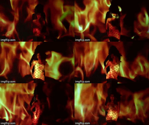
The fire poi shot was quite grainy, and so we used procAmp to turn the contrast up and the brightness down, making the grain less visible, and enhancing the visual effect of this shot. We wanted this shot to be very shit, with the fire and glimpse of Olivia being lit by the fire showing.


Luma Corrector:
ProCamp, Luma Corrector & Colour Corrector used on the fire shots

The Luma Corrector was very useful when it came to grading the fire shots. We wanted to preserve the vibrancy of the shot, really ensuring none of it was lost, whilst having to brighten the image - as it was a pretty dark image. The image above, showing the Luma corrector, along with ProcAmp and Colour Corrector were the exact effects we used post-production.
Graded                          Ungraded


Colour Finesse:
Graded                        Ungraded 
This was used on the silhouette shots, which needed special attention. We wanted balance the light and dark tones, making the shot more contrasted and darker, without losing the artist to shadows. Colour Finesse had much more precise adjustments, so that we could grade in a more effective way. All other alternatives didn't give us the precision that Colour Finesse did.


Removing Grain

Our original shot in Trafalgar Square, due to the darkness on the location, was very grainy, something which we didn't want in our footage for this particular shot. We had to remove the grain in After Effects to get a clearer image:
Removing the grain in After Effects
Bad Memory Style Grading
For the bad memory style grading of the argument scenes, we had to use a number of effects on the footage. 
Graded                                        Ungraded
Firstly, we put a vignette over the footage to make it darker around the edges:
The vignettes on the footage on our timeline
I then experimented with adjusting the colour, to make it more of a desaturated grey tone using ProcAmp. I then also added a grainy effect to it by using the 'noise' and 'dust & scratches' tools: 


Editing our publicity shots

Matt and myself took it upon ourselves to do most of the citing, whilst Josh and Harry worked on the album cover or website. We used Photoshop to edit our publicity shots.


Below you can see an example of how we edited the promotional shot, particularly to adjust the colouring. The original photo is quite red/pink, and so we used the 'Color Balance' adjustment tool on photoshop to counteract this red with cyan and the pink with green. This was a common problem, and so with many of our photos we had to use this. We wanted the skin tones to seem more accurate to real life, and the background to be white as that is an industry standard.
Original Image                                             Edited Image

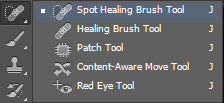
  We enhanced the images by firstly getting rid of the red hue, and having the white background actually white. We then made them more striking, with less washy colours, and more contrast - using a 'Contrast/ Brightness' adjustment tool, seen below in the selection of tools available on Photoshop to enhance images:


Certainly for the first image shown above, 'Auto Colour' was used initially to get rid of the red tones and balance the images colours, which we then could go on to perfect using the tools above, like 'Color Balance' and 'Brightness/Contrast'.

For the album cover, we needed to cut Roza out of the white background and onto a rose background, and we used the 'quick selection' tool to get Roza without the white background; but because of my unruly hair, we had to use the 'refine edge tool'. This would allow us go through specific parts of the cut out image, and redefine what is cut out and what isn't. This was useful as it then didn't look poorly cut out, with chunks of hair missing. We also used a feather effect when cutting Roza out, so that the cut out image had a more faded outline.
'Refine edge' tool with 'feather' option on 'adjust edge'

We also used a 'spot healing' tool to perfect any blemishes on the face. This was again, an industry standard that we needed to uphold. We also used the 'healing' tool, which takes patches from your desired area on the image, and clearly blends that on top of whatever you like. This was very useful in instances where my skin wasn't even and we needed to correct this.
 
'Spot heal' tool


To smoothen skin, we were able to use a 'Smoothen' action on Photoshop to create an air-brushed look for our publicity shots, again, an industry standard, especially within the R&B genre. The image below was one of our bed examples of the effect of this skin smoothening effect, and also one of the photos I spent the most time editing, as it was a good shot, just very poorly lit etc:

I had to turn the brightness and contrast up, and use the selection tool to select my face, as it was the darkest point on the photo. I needed to separate my face from the rest of the image as I couldn't adjust the brightness any more without over-exposing the rest of the image. Therefore, once selected, I could brighten the face further, without over-brightening the rest. I also could adjust the colouring further, without making the rest of the image too blue/green. Once I got the image to a better standard I could then smoothen all of the skin.


Wednesday, 10 December 2014

The development of our music video

Initial Music Video with my commentary:

We asked our teachers to watch our music video once we had put everything together, and the commentary below is a summary of that feedback, and my own added to it.


Following this, we began to develop our ideas on how to
1) better establish our artist identity, and
2) give our video a more structured and less disjointed structure.

We went about this by:
  • Making performance beds on our edit suits for each performance shot, so that we could look at all of the option we had to go back on.
  • Creating a close-up beauty shot to start the video and run throughout - establishing our artist. 
  • Re-shooting our performance shots and getting more close-up angles, which we previously lacked. 
  • Structuring the narrative so that it climactically has beginning, middle, and end; and introducing it once the performance shots have been put in.
  • Splitting up the concept shots, and looking through and pedantically picking specific points to put the concept in correlation wight he performance and lyrics. 
  • Using our performance shots to show different aspects of our artist, i.e. the roses shot is more angry, the fire shot more powerful and sexy, the silhouette shot is more timid and emotional and the beauty shot is more rounded. 


The development of our website - Style & Layout

We started off knowing that we wanted to keep within the PBR&B genre and keep our website simplistic and with a strong theme of black and white.
We too examples from three main PBR&B & R&B artists

The Weeknd:


I liked and took inspiration from:
  • His black and white style, with the items turning grey when you scroll over them or click on them.
  • The fact that you were redirected to his sites e.g. Facebook, Twitter etc. and iTunes for music, so that you can follow him directly. However we thought incorporating that into the website would work better, so that you are not being constantly redirected. But this did show an effective way of presenting opportunities to follow him on social media, and buy his goods directly.
  • The artistic photos throughout that give a real sense of artist style and identity.

Jhene Aiko:


I liked and took inspiration from:
  • Her lyrics appearing - although not being the very first thing you see. 
  • The poetic style of her website, we wanted to incorporate this with a 'About Me' type of page, with a poetic verse that the artist would write herself, on herself. This would give a sense of identity and give the audience a feel of an intimate, personal connection. This would be similar to the lyrical and poetic verse that first comes up.
  • Her 'press' page that presents her as a celebrity, someone written about and photographed professionally. I especially like the fact that there were pictures of articles about her. 
  • The fact you can listen to her music on sound cloud there and then on the website - for free. This presents her as someone really about the music, and not centred around profit, which we want for our artist as well. 
  • Her 'read' page linking to her tumblr - again, a personal and intimate touch, connecting her as a real person to her fans. This ask encouraged her fans to follow her on here, and her various other social media.

Tinashe:


I liked and took inspiration from:
  • The black and white style, with the items turning grey when you scroll or click on them.
  • The 'news' page presenting her as a celebrity, but also showing competitions and chances for the audience to interact, which we wanted to incorporate.
  • The opportunity to buy her music on iTunes, but also Amazon, catering to different needs, and seeming less mainstream.
  • The chances to book tickets to her shows, buy her goods, contact (email) her and follow her on social media; with there even being a very direct link to Facebook, with opportunities to comment and share everything incorporated within the website, e.g. in a 'comment' box which is automatically linked to your own Facbook. This really effectively encouraged audiences to share and interact with her. She also had a 'Sweetees' page dedicated to her fans of the month, with a little message 'written' below. This again connected her to her fans, and stimulates her fans to want to feature on that page and so get involved with her in the hope that they will.


The development of our digipak album cover

Our influences or the album art work didn't solely reside within the R&B genre, but we took inspiration from female solo artists in general. The ones we felt drawn to the most seemed to be more simplistic:


However, we wanted something in colour, suiting to our simplistic style of our artist. We wanted to keep her association with a rose, and so incorporate that throughout. This initially turned into a drawn up version of our album cover:
Our artist posed on the front cover of the album
The whole flat plan for our album
Myself and Harry then turned this into a digital version, using an image similar to what we would use:


The prezi below illustrates the journey of our album digipak henceforth:


The development of our website - Content

Once we had our style and general layout figured out, it was time to work on the content. The website is a promotional tool, something ultimately to encourage the audience to interact, purchase, and receive some form of gratification.

Purchase opportunities:


Album:

One of our most important purchase opportunities is our artist's debut album. Hence, we have constant reminders and opportunities to buy this:
The first thing you see on the homepage

The first thing you see to enter the site (on the landing page)
We added a count-down to this, as it encourages the audience to anticipate the album release, and reminds them of it's approach. We also added a discount coupon to encourage the audience to purchase immediately to get the deal whilst it lasts.

Online Store:
Merchandise:
We made lots of merchandise in a variety of sizes and colours to attract audiences to buy this. Not only did we make merchandise for Roza, but we thought that it was a good opportunity to sell Raw Sound Records merchandise too. They can buy this straight from the website, and keep items in their shopping basket whilst browsing through the website, as the shopping cart appears on each page.
Album:
You can also pre-order the album, both the hard copy and digital copy, attracting and giving audiences the choice.
Signed Posters:
There are also a variety of posters available, signed in different coloured pens, by Roza. This, in particular, gives the audience a more intimate connection to the artist.
Merchandise in the online store

Live concerts: 
On the 'Latest' page audiences can see  dates and details for Roza's live concerts and tour, and are able to  buy tickets to them directly on the website, in the same way the  online store works.


Scrolling advert box:
Reminding the audience of purchase opportunities on the Homepage; the chance to see Roza live and buy tickets to that, and the chance to buy her album.
Advert scroller


Interactivity & Gratification:

From the very first landing page, the audience are shown the album real ease and invited to enter the website:
Encouragement to go to main site from the landing page

Live twitter feed
Social Media:
Instantly on the homepage there is a live twitter feed, with posts to encourage the audience to interact and follow Roza.
There is also a twitter 'follow' button at the corner of every page on the website, and at the bottom similar links to her twitter and instagram. 


Encouraging audience to follow
on Twitter - on every page

Link to Instagram and Twitter
 attached to footer


Subscription:
Audiences can also subscribe to get emailed exclusive updates on Roza and weekly newsletters, and are encouraged to do so constantly by this feature being at the bottom of every page.

Contact Page:
There is also a contact page with a personalised message to audiences encouraging them to contact Roza through the website system. There is also then a map and contact details of Raw Sound Records.
Contact Page
Competition:
We created a competition to really get fans involved and gratify them as fans, which is shown at first on the Latest page, which is linked to it's own page:
Link on Latest page
'Competition' page

The competition itself also encourages audiences to:
  • Pre-order the album
  • Engage in social media activity and/or interactivity with the 'artist'

And gratifies them by entering them into a raffle to meet Roza, with runners up receiving signed posters.

Photo Gallery:
Audiences are encouraged to click and browse through exclusive publicity shots, and are able to access exclusive rebind the scenes photos from Roza's music video with personalised captions, which audiences are then encouraged to share on social media.


Articles on 'Latest' Page:
These encourage the audience to read about Roza and share these articles onto their social media pages where they can add their own opinions. 


Tuesday, 18 November 2014

Shoots

Please feel free to click on any images or videos in the Prezi below: