In order for our product, the artist, to sell, we needed to create a distinct and synergistic brand and identity. The stronger this brand and identity is established, the better it will impact on audiences, and so we had to ensure we had distinct motifs throughout our texts; to ensure that each text is working to promote the same product: the artist & their music.
We firstly realised that in order to create this synergistic brand we needed recognisable motifs for the artist. We referentially used Jhene Aiko in this respect:

In my opinion, the strongest by far of our motifs was the iconography of the rose. We incorporated the rose imagery into everything, our music video, publicity shots on the website, and our album digipak. Even our artists name was in line with this rigid motif. We were very pleased with the fact we were able to find something to use so easily that really went with the artist we were trying to sell i.e. roses connote themes of love, romance, emotion, passion etc and our artist encompasses these themes within her music.
We made sure to include this anywhere possible, and so although small, even just adding a rose emoji to her name on Instagram and signing off with one on social media, still keeps a synergistic approach, which we wanted to adopt.
Coinciding with the rose imagery, we kept to a colour scheme of red, black, white and grey. This was very in line with our genre and was something we thought would work well across all three of our texts.
In the music video this was harder to keep to, but we still did so within costumes, which broadly stayed within that scheme. However we did not want to seem too dull or unadventurous and so played about with a few other simplistic colours in the video.
In the music video this was harder to keep to, but we still did so within costumes, which broadly stayed within that scheme. However we did not want to seem too dull or unadventurous and so played about with a few other simplistic colours in the video.
In the album digipak and website it was much easier and conventional to stick to colour schemes and so we felt it worked well.
 |
| Album digipak with strict theme of red, black, white & grey |
 |
| Website homepage with theme of black, white, grey and some red |
We created a distinctive 'Roza' logo to furthermore keep reaffirming this branding. This was kept consistently across the album and digipak, but we felt that in the music video it would not work as well. Many artists do have their branded name logo in videos, but we found that they were long-established artists and so it would be unconventional for a debut artist such as ours.
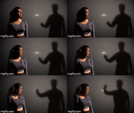
 The music video establishes this through literal shots like her dancing in a fire projection, and through her slapping her boyfriend for instance.

This shot shows a more vulnerable and emotional side of Roza. The close-up allows an intimacy between the audience and Roza, in which they can feel authenticity in the star identity.
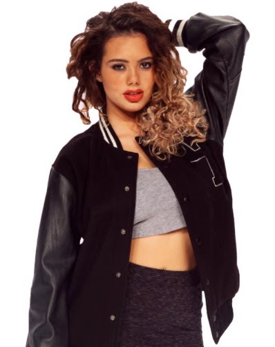
On the album digipak we wanted to keep establishing our artist as an emotionally open person, as seen above in our video. This will particularly appeal to our primary audience, as it is a genre characteristic.
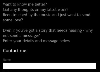
This 'contact' page on the website makes our artist seem like a down-to-earth, sincere person interested in the thoughts and feelings of other; contributing to an open and thoughtful star persona.
 Throughout the video the audience sees Roza overcome her bad relationship, and be empowered and independent, seen for instance by her throwing away Roses and walking out on her boyfriend.

The inside cover of the album digipak also shows off a fun and playful side to Roza, as illustrated in the photo. Her twitter feed on the website also shows the audience her fun and social side, and encourages them to keep up to date by following her.
Jhene Aiko also has a very distinct artist name logo:
STAR IDENTITY:
Our overall product was the artist & her music, and our aim is to have audiences buy into this product, this image and identity. Audiences will base their understanding of the star's persona on the sentiments expressed through their songs, however stars will need to constantly re-affirm this identity through more than just their songs. Fans will use any text to read into a star person, and so all texts need to have the same goal in mind.
Making this identity seem real, and not 'constructed' as Richard Dyer notes that it is, is important. Audiences won't spend money on the product, e.g. by buying albums, tickets or merchandise, if they don't buy into the star identity. We followed Richard Dyer's theory that a 'star' is 'an image, not a real person, that is constructed out of a range of materials', in order to construct a viable product.
This star identity is to be established through songs and performances initially, but in order for a synergistically successful campaign, this identity will need to be reiterated and complimented through other texts such as websites, album covers and social media.
We firstly needed to establish our star identity, which this interactive image below underlines:
Fiery, Fierce, Passionate:
 The music video establishes this through literal shots like her dancing in a fire projection, and through her slapping her boyfriend for instance.
Promotional shots on the website of Roza looking powerful and passionate also maintain this persona:
Emotional, Sincere, Thoughtful:

This shot shows a more vulnerable and emotional side of Roza. The close-up allows an intimacy between the audience and Roza, in which they can feel authenticity in the star identity.

This shot shows again a vulnerable side to Roza, and allows the audience to see how haunted she is by her past lover and al that he represents. This will allow audiences, especially our target audience of PBR&B fans who usually consume music with themes of love and emotion, to relate to her emotions and consequently they will be more likely to buy the single and buy into the star identity.
On the album digipak we wanted to keep establishing our artist as an emotionally open person, as seen above in our video. This will particularly appeal to our primary audience, as it is a genre characteristic.
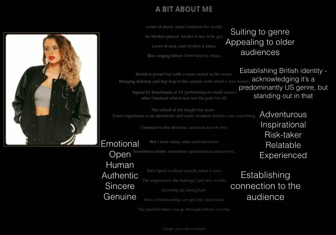
This 'about me' section is in the form of a poem. This poetic style links with much of the artistic imagery of water and fire in the music video, and makes our artist seem poetic and artistic across these platforms. The poem itself is a text that builds to a star persona that is adventurous, open, down-to-earth.
This 'contact' page on the website makes our artist seem like a down-to-earth, sincere person interested in the thoughts and feelings of other; contributing to an open and thoughtful star persona.
Independent, Dominant, Powerful:
 Throughout the video the audience sees Roza overcome her bad relationship, and be empowered and independent, seen for instance by her throwing away Roses and walking out on her boyfriend.
The album front cover also promotes this powerful image, as the pictures annotations illustrate.
Posts like this on the 'Behind the Scenes' section on the website, although only showing that she does her on make-up, connote her independent, empowered and 'can-do' personality.
Playful, Sexy, Fun:
The fire shots were one way of showing the audience Roza's playful and sexy side, with lots of playful close-ups, and dancing in the long-shots.

The inside cover of the album digipak also shows off a fun and playful side to Roza, as illustrated in the photo. Her twitter feed on the website also shows the audience her fun and social side, and encourages them to keep up to date by following her.
The website itself is conventionally used to bring together different texts in one place for the audience to see. Our website does this whilst encouraging the audience to get better acquainted with our artist through things like the 'about page', 'contact page', news articles and social media feeds, and even a competition to meet Roza. This is in addition to the album promotion and music video on the website.
From our audience feedback I found that many people thought that there was synergy between all three texts that worked well together.
Below is a collection of some of the artefacts from all three texts to show their synergy:
We also asked a variety of audience members how effective they thought the products worked together:
They all agreed that the music video, album digipak and website worked very effectively together in establishing a synergistic brand and star identity, as do I.
This is not to say that it was wholly effective, I think, like some in the video above, that the website and album digipak work better synergistically, and the music video could be more effectively combined with the ancillary texts.
 Something as small as having her signature logo appear at the beginning, like The Weeknd's in his music video 'Wicked Games'.
I think this would create a more effective combination as it would have a visual link to the album cover and website, which was lacking in our music video. Feedback said that the website and digipak had a very strong sense of synergy, and I think we should have extended this to the music video more. I think that that's one of the reasons why the music video isn't as effective as i could be in combination with the ancillary texts: it's strongest visual link is the artist and the rose; which we emphasized as much as possible in the music video, but needed to emphasize this link between all three products further.






No comments:
Post a Comment