Introduction

My name is Ysabel Hudson Searle (candidate number 0331) and this is my Media Studies coursework blog, featuring my ongoing work. I am in Group 2, along with Harry Kettenis (0390), Matthew Romo (1660) and Joshua Stevens (0796). This is the link to our live facebook page: Group 2's Facebook Page.
You can use the labels down the side to navigate your way through my blog.
Thank you!

Music Video

Our Music Video:

Group 2 Website

Our Website - Click to enter.


Our Album Digipak

Our Album Digipak
Our Album Digipak

Sunday 21 December 2014

2) How Effective is the combination of your Main Product and AncillaryTexts?

In order for our product, the artist, to sell, we needed to create a distinct and synergistic brand and identity. The stronger this brand and identity is established, the better it will impact on audiences, and so we had to ensure we had distinct motifs throughout our texts; to ensure that each text is working to promote the same product: the artist & their music. 

We firstly realised that in order to create this synergistic brand we needed recognisable motifs for the artist. We referentially used Jhene Aiko in this respect:


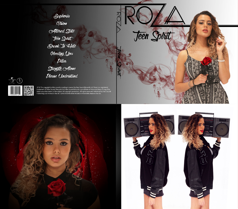
In my opinion, the strongest by far of our motifs was the iconography of the rose. We incorporated the rose imagery into everything, our music video, publicity shots on the website, and our album digipak. Even our artists name was in line with this rigid motif. We were very pleased with the fact we were able to find something to use so easily that really went with the artist we were trying to sell i.e. roses connote themes of love, romance, emotion, passion etc and our artist encompasses these themes within her music.

We made sure to include this anywhere possible, and so although small, even just adding a rose emoji to her name on Instagram and signing off with one on social media, still keeps a synergistic approach, which we wanted to adopt.  
Publicity shots with roses in it 
Coinciding with the rose imagery, we kept to a colour scheme of red, black, white and grey. This was very in line with our genre and was something we thought would work well across all three of our texts.
In the music video this was harder to keep to, but we still did so within costumes, which broadly stayed within that scheme. However we did not want to seem too dull or unadventurous and so played about with a few other simplistic colours in the video.

In the album digipak and website it was much easier and conventional to stick to colour schemes and so we felt it worked well.
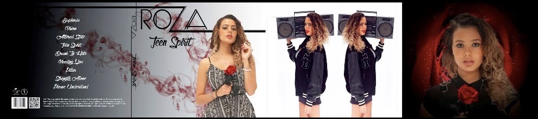
Album digipak with strict theme of red, black, white & grey
Website homepage with theme of black, white, grey and some red

We created a distinctive 'Roza' logo to furthermore keep reaffirming this branding. This was kept consistently across the album and digipak, but we felt that in the music video it would not work as well. Many artists do have their branded name logo in videos, but we found that they were long-established artists and so it would be unconventional for a debut artist such as ours.
Jhene Aiko also has a very distinct artist name logo:


STAR IDENTITY:
Our overall product was the artist & her music, and our aim is to have audiences buy into this product, this image and identity. Audiences will base their understanding of the star's persona on the sentiments expressed through their songs, however stars will need to constantly re-affirm this identity through more than just their songs. Fans will use any text to read into a star person, and so all texts need to have the same goal in mind.
Making this identity seem real, and not 'constructed' as Richard Dyer notes that it is, is important. Audiences  won't spend money on the product, e.g. by buying albums, tickets or merchandise, if they don't buy into the star identity. We followed Richard Dyer's theory that a 'star' is 'an image, not a real person, that is constructed out of a range of materials', in order to construct a viable product. 

This star identity is to be established through songs and performances initially, but in order for a synergistically successful campaign, this identity will need to be reiterated and complimented through other texts such as websites, album covers and social media. 

We firstly needed to establish our star identity, which this interactive image below underlines:

Fiery, Fierce, Passionate: 

The music video establishes this through literal shots like her dancing in a fire projection, and through her slapping her boyfriend for instance. 
Promotional shots on the website of Roza looking powerful and passionate also maintain this persona:


Emotional, Sincere, Thoughtful: 


This shot shows a more vulnerable and emotional side of Roza. The close-up allows an intimacy between the audience and Roza, in which they can feel authenticity in the star identity.


This shot shows again a vulnerable side to Roza, and allows the audience to see how haunted she is by her past lover and al that he represents. This will allow audiences, especially our target audience of PBR&B fans who usually consume music with themes of love and emotion, to relate to her emotions and consequently they will be more likely to buy the single and buy into the star identity.


On the album digipak we wanted to keep establishing our artist as an emotionally open person, as seen above in our video. This will particularly appeal to our primary audience, as it is a genre characteristic.
This 'about me' section is in the form of a poem. This poetic style links with much of the artistic imagery of water and fire in the music video, and makes our artist seem poetic and artistic across these platforms. The poem itself is a text that builds to a star persona that is adventurous, open, down-to-earth. 


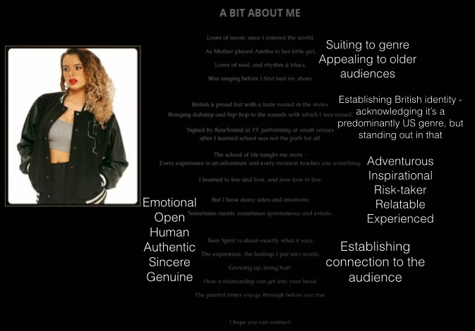
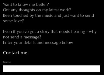
This 'contact' page on the website makes our artist seem like a down-to-earth, sincere person interested in the thoughts and feelings of other; contributing to an open and thoughtful star persona.
Independent, Dominant, Powerful: 
Throughout the video the audience sees Roza overcome her bad relationship, and be empowered and independent, seen for instance by her throwing away Roses and walking out on her boyfriend.
The album front cover also promotes this powerful image, as the pictures annotations illustrate.

Posts like this on the 'Behind the Scenes' section on the website, although only showing that she does her on make-up, connote her independent, empowered and 'can-do' personality.


Playful, Sexy, Fun: 

The fire shots were one way of showing the audience Roza's playful and sexy side, with lots of playful close-ups, and dancing in the long-shots. 


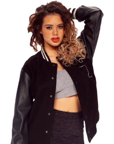
The inside cover of the album digipak also shows off a fun and playful side to Roza, as illustrated in the photo. Her twitter feed on the website also shows the audience her fun and social side, and encourages them to keep up to date by following her.

The website itself is conventionally used to bring together different texts in one place for the audience to see. Our website does this whilst encouraging the audience to get better acquainted with our artist through things like the 'about page', 'contact page', news articles and social media feeds, and even a competition to meet Roza. This is in addition to the album promotion and music video on the website.
From our audience feedback I found that many people thought that there was synergy between all three texts that worked well together. 
Below is a collection of some of the artefacts from all three texts to show their synergy:


We also asked a variety of audience members how effective they thought the products worked together:

They all agreed that the music video, album digipak and website worked very effectively together in establishing a synergistic brand and star identity, as do I. 

This is not to say that it was wholly effective, I think, like some in the video above, that the website and album digipak work better synergistically, and the music video could be more effectively combined with the ancillary texts.

Something as small as having her signature logo appear at the beginning, like The Weeknd's in his music video 'Wicked Games'.
I think this would create a more effective combination as it would have a visual link to the album cover and website, which was lacking in our music video. Feedback said that the website and digipak had a very strong sense of synergy, and I think we should have extended this to the music video more. I think that that's one of the reasons why the music video isn't as effective as i could be in combination with the ancillary texts: it's strongest visual link is the artist and the rose; which we emphasized as much as possible in the music video, but needed to emphasize this link between all three products further.

3) What have you learned from your Audience Feedback?

Our Audience:


We have always placed importance on feedback, whether it be asking for feedback from a group member on an edit of a publicity shot, or feedback from staff on our whole music video, we have placed such prominence on feedback in the making of our texts.


Our target audience is fans of the genre, particularly of the sub-genre PBR&B and so we asked peers who were fans, and so our target audience what they thought of our music video. This was at early stages in our video, when we had generally put everything together and so started experimenting with effects that could work.

To summarise their feedback:
  • Edit more to the tempo of the song e.g. more fades at slow points, and quicker full cuts as the tempo picks up 
  • The effect on the narrative didn't work well and was confusing, they suggested a type of sepia grading instead
  • The hair-flick was over-complicated, needed simplifying to work well.
This feedback was crucial in improving our music video and served to show that a 'fresh pair of eyes' really is key throughout the development of our texts.

We got feedback in early stages of our digipak too, after we finalised a version and asked for opinions.
First version
The main criticism was the lack of connection between the from and the back. Whilst we thought that it would be clear due to black and white being conventional opposites, others felt that it just looked like a completely different album. Not wanting to go all white, or all black, we decided to try a gradient from black to white, so that there is more of a smooth transition and connection between the two.
Improved version
The website also was critiqued in the earlier stages of construction, and changes were made accordingly. For instance, our contact page was criticised on being too plain and looking unprofessional, and so we embedded a map to show the 'Raw Sound Record offices'.
After feedback
Before feedback


Once we finalised all of our texts we asked various people a few feedback questions, summarised and seen in the videos below:

The Music Video

To summarize feedback:
  • The video was enjoyable to those people, was visually stimulating and worked well with the lyrics and song.
  • However people did have improvements, varying from the changing and personalizing the bedroom set, cutting the artistic conceptual shots for more narrative shots. 
  • The genre was clear, although we were working within a sub-genre of PBR&B, which is less known, and so we got a variety of answers as they tried to pin-point the genre: R&B, Urban, Soul, Alternative & Indie.
  • The artist came across well; compared to Rihanna, cool, independent, unique and a strong female.
  • The narrative came across well, everyone understood the story line, if not commenting that there could have been more narrative.
  • Artistic conceptual shots came across well - sleek, stylish. 
  • The video overall looked professional. 
The Album Digipak

To summarize the feedback:
  • People seemed to think the album digipak looked professional, the colours and pictures seemed attractive and representative of the genre and the artist.
  • Most seemed to think it was eye-catching, but not everyone would buy it due to the music content itself.
  • The writing of the song titles was not clear to everyone, and the album cover itself could have been more mysterious and intriguing - with a story of its own. 
The Website

To summarize:
  • The website seemed professional, fun, easy to use and the countdown on the landing page and home page built up excitement and was a nice addition.
  • The colour scheme and style worked well, although not all thought it was representative of the genre. 
  • Was synergistic with the rest of the texts.


To summarise:
  • Overall synergy between the combination of products worked well.

 We created a survey on surgery monkey after finishing our video and posting it, and found that:

  • The R&B genre was well-established
  • The overall theme of relationships came across in the music video


People were asked to leave an overall comment on their views on the video, which were very useful:


We were happy that the theme of water and fire was picked up on - something I wasn't sure we put enough emphasis on - mainly in terms of water, but to some it was good.


The more conceptual and artistic shots were perhaps not integrated smoothly enough for audiences to pick up on their meaning. This was to be expected to a certain extent, as metaphorical meaning is often not grasped on the first viewing.


Overall, I was pleased with how Roza and her identity came across on all three platforms, especially as it generated interest. 
I think that I have learned a lot from audience feedback which will help me in any similar future situations. Below are the top things I learnt from each text that would aid me in making improvements and changes:

Music video:
The top thing would probably be planning the shots better. The conceptual shots needed more thought and a stronger link to music video as a whole. The narrative shots also needed more thought and planning as I found that the audience felt that those shots were probably the weakest. Although I think the narrative story was clear and well received, I think that the visual presentation of the couple could have been made more realistic and set up better (mise-en-scene).

Album Digipak:
The font of the track listing wasn't clear to audiences, which could actually be a very big issue for sales if the audience have trouble reading the track list, they probably put it down and won't bother buying the album. 

Website:
Similarly to the changes I'd make above, the font on the autobiography caused difficulty for some, I also learnt that the poem style itself could be alienating and pretentious which I hadn't thought of before the audience feedback process. I would also make the website more visually stimulating, with more videos, gifs and images, especially on the latest articles. 


4) How did you use New Media Technologies in the Construction and Research, Planning and Evaluation Stages?


Research & Planning:

Web 2.0 

Entirely researched online 
This was crucial as the internet was the source of much of our research. Whilst we wrote things down on paper and printed images out, most of our planning involved the internet at some point.
Research into referential artists and 'looks'


YouTube played a key role in finding references and inspirations in the very early stages, and throughout. As you can see below we created a playlist with ideas to help us in those early research and planning stages.
The internet also allowed us to communicate as a group via Facebook, Whatsapp & iMessage, as seen below. Obviously this wouldn't be possible if not for the technologically converged mobile phones we used throughout this process. The portability of all this converged technology made it easy to communicate wherever we were, including in school, where we would text each other to come to the edit suite e.g.  


Once all of the group members were able to use iMessage through iPhones, we used this the more than the other forms of contact. iMessage allowed us to send text messages, photos, videos and audio messages, and had the immediacy of a text message. We used this to discuss key decisions, share thoughts and ideas, keep each other up to date and stay in contact.


Whatsapp was our first group chat, which is an internet based messaging system. We could send text, images, videos and audio. However I found that iMessage was more useful because Whatsapp needed the internet to even just load the chat, so if you didn't have internet you couldn't just look over the chat; as you could with iMessage as it was stored in messages on your phone.


Facebook was definitely an advantage as we could create a group page where we could store and share images, videos and documents; and get feedback through comments. However we probably used this least for discussions as there was more immediacy with iMessage & Whatsapp. We used Facebook more to store things like photos and some documents, and we used iMessage and Whatsapp for discussions.


Construction:

Web 2.0 was also key in our construction as it allowed us to create a website using wix. Wix makes website design very simple and easy, with no HTML coding to do by ourselves. It allowed us to make our website interactive and technologically converged, easily allowing us to add in text, images, videos, links and applications for things like social media. This was extremely important for our website, as we wanted to make it as technologically integrated and converged for our audience.
Wix HTML Editor
We also used it for the Twitter and Instagram pages of our artist, which is crucial in today's social media climate. We were able to integrate the social media profiles within each other, via links and the website, as seen below.


We used a Canon 5D Mark 2, filming in 1920 x 1080p with HD video capability. This was such a benefit to us particularly in the fire shot. Before, the colour is dull and in very poor quality, then we filmed with the 5D and the colour became vibrant with a much higher quality resolution:
Canon Legria
                                                               Canon 5D Mark 2
Canon Legria                                 Canon 5D Mark 2


Canon Legria 'on the go'
The Canon Legria HFG30 did work well on many of our other shots, like the Silhouette shots. We mainly used it for narrative shots and our shots out of the studio, because of it's portability, and easy 'point and shoot' technology. 
Canon Legria filming in Oxford Street


Editing software:


Premiere Pro 

This was the software we used to edit together our music video, and various other videos for the blog construction and evaluation work. It's multi-track layout made it very easy to edit together in a non-linear format - all preferable for our music video.
Multi-track, non-linear editing format on Premiere Pro


Premiere Pro was very useful when it came to effects and grading; I myself learnt new things like the ghosting/echo effect


I also learnt how to grade the narrative shots to make them look like past memories (particularly bad) and I was very pleased with the outcome.

Perfecting previously learnt skills, like transitions, fades and overlaying footage on top of one-another was also very useful.

Photoshop 
Using the skin smoothener action on a cut out image of Roza
Photoshop was crucial in getting our publicity shots to the industry standard required i.e. the air-brushed effect.
[pics of before & after]
As you can see, photoshop allowed me to hide blemishes, smoothen out skin, adjust colourings, cut out unruly strands of hair and whiten the backgrounds of the shots.

Editing photos of Roza


Photoshop also allowed us to cut out Roza's image and put it on the digipak without looking like it had been poorly cut out (as Photoshop gave precision).


Harry programming pre-sets on the lighting desk


We were fortunate enough to have a Lighting Desk to use in the studio for the music video and publicity shots. This was a Leapfrog Lighting Desk controlling our Arri 1000k studio lights. We were taught how to use it, and pre-set out lighting set ups for each shot; which, whilst taking a fair amount of time to do, made things very easy and swift once we had the set ups.


Setting up the 5D above the projector

For our fire scenes, we had to use a Projector to get the flames video on to the studio cyclorama. This didn't pose any real difficulties and we were very grateful that we had such a lightweight and portable projector, especially as for the close up fire scenes it had to be hand held in place.
Josh having to hold the projector in place 

Evaluation:
Web 2.0: 
Blogger:
Blogger was obviously a key component in my evaluation answers. Blogger allowed me to create and edit answers in posts and add images, videos, gifs and embed things like YouTube videos and Prezis. This allowed me to answer with interactivity and technologically converged media; giving me variation in my evaluation.

However, I found difficulties using blogger in terms of it's format for presentation. Creating and editing the content presentation within the post was not too complicated, but the complications came when the posts were published. When they published, the presentation was different to the editing process and so it caused limitations in terms of the simplicity and precision given to make the posts ascetically pleasing.

This does not outweigh the advantages of using a blog on my coursework. Using a blog allowed for interactivity and converged technology which would otherwise be unavailable in some other formats.


Prezi
Prezi was a very useful tool to use as it gave me the ability to vary my approach to the evaluation answers. It was technologically converged so that I could use images and videos on a text presentation.


Padlet
Padlet also served a similar purpose to Prezi, but incorporated gifs into the presentation which I found more useful. However on several occasions I lost my work on Padlet due to the inability to save your work as you go along. This meant I had to re-do a lot of work, but was still a beneficial tool.


Survey Monkey
Survey Monkey is an internet based survey system which enabled our group to collect feedback from a wider variety of people. It meant we could rely on the internet's viral aspect to reach people that we wouldn't have otherwise reached as we didn't know them. We wanted a wide range of opinions to make sure that the results were as reflective and accurate as possible.
I thought it was really easy to create your questions and answers specific to your survey, and the fact that you could create answers with given options and also one's where people have to comment themselves was really beneficial to our audience feedback.

Canon Legria HFG30 
Filming the feedback interviews

We used the Legria to film our interviews, as it was easy to set up and use for a basic video of audience feedback. Premiere Pro was used to edit together all of this footage.


Email:
Thanks to the internet based Microsoft Outlook Web App I was able to get feedback from my teachers on my blog and evaluation work. I found this very useful as it was like a checklist to go over and ensure that I did everything.