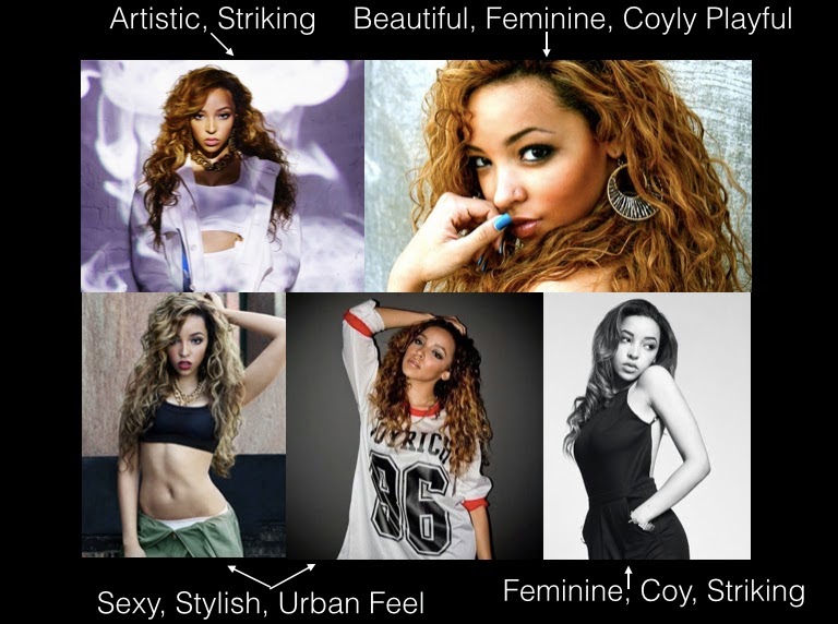
Introduction

My name is Ysabel Hudson Searle (candidate number 0331) and this is my Media Studies coursework blog, featuring my ongoing work. I am in Group 2, along with Harry Kettenis (0390), Matthew Romo (1660) and Joshua Stevens (0796). This is the link to our live facebook page: Group 2's Facebook Page.
You can use the labels down the side to navigate your way through my blog.
Thank you!

Music Video

Our Music Video:

Group 2 Website

Our Website - Click to enter.


Our Album Digipak

Our Album Digipak
Our Album Digipak

Tuesday, 18 November 2014

Casting

The roles we needed to cast, and those we chose are below:

Roza:
Character profile: The young (21) female PBR&B artist from London.
YsabelActor: Yssy (myself)
We decided that with my acting experience, and experience acting in a music video (the prelim) and therefore ability to lip sync, that this would be a suitable choice. Not only this, but we felt it would be more efficient to keep the roles within the group.


The boyfriend:
Character profile: This is the boyfriend of the artist, of whom she has a turbulent relationship. Whilst he must have chemistry and intimacy with the artist, he must also be able to show the opposite, as in various scenes they must be arguing and show really passionately negative emotions towards each other too.
MeActor: Harry
Wanting to keep it within the group as much as possible, we thought that Harry, whop is in our group would be a good selection. Another male was also put forward who wasn't from our group, but suited the role and had acting experience. The screen tests are shown below. From these we concluded that Harry and Yssy would be a better couple for the role.


Audition videos for the boyfriend can be seen below, we filmed an argument scene, and then a happy couple scene, to see how well the dynamics were for our happy and unhappy scenes.


We also auditioned another candidate for the role of the boyfriend, and the audition videos can be seen below.


However, in comparison to Harry, there wasn't as much natural chemistry and these videos show a lack of comfort, and were generally more awkward.

We also have a few other roles:
Josh StevensonSillhouette:
We originally cast Matt for this, however, Josh was able to rehearse with me a sequence for this shot, and Josh's shadow looked better as he had a bigger build, and so we cast him instead.


Matt

Drummer:
Matt
Back:
Matt

Friday, 31 October 2014

Flat Plan: Website

We looked at various webisites within our genre, to ensure that we had a good idea of the conventions within the PBR&B genre. We particularly liked The Weeknd's website:
It was a very minimalistic style, with a black and white theme. We really liked this and wanted to do something similar with our website.When the mouse goes over the links, for instance, 'LIVE', as shown in the picture above, the title changes for white to grey. This is also something we particularly liked.
We decided to conform to conventions of having a header/banner with an

These are basic flat plans for our website for each different page with the general design we want:
    

Publicity shots


In the image above, I sketched out the type of poses and outfits we discussed for publicity shots, along with photos that coincide with the ideas. It has a very urban feel, without being too sexualised, which is what sometimes happens with females within the PBR&B genre. We didn't want to conform to this convention.

These were some photographical and sketched ideas for poses with the rose publicity shots. We have a strong link within our music video and within the album cover and so on, between her name - 'Roza', and roses. I think having a link like this can prove very useful, as it directly associates the two, and so when seeing a rose, the artist is thought about and her name is made more memorable. It's also useful that a rose is a beautiful flower, as it associates her with positive imagery and also links in with themes of love - which are present in her music.

To create a strong British identity, I thought it could be fun to do publicity shots like those above, with her playfully drinking tea, or eating 'nice' biscuits - something establishing her as a British or even London girl, and showing her in a more down-to-earth, relatable way. 

I also thought shots like these would be something a bit different and a bit more intimate and personal; having her in a domestic setting, with playful poses, again to create a sens of intimacy and relatability between artist and audience.

One of the first publicity shots we decided on as a group was inspired by an image seen on Jhene Aiko's website (image to the left), and thought that it would be good to have some shots of a similar style, as shown sketched above. The man's shirt connotes themes of love, relationships and sexuality, and so would tie in well with the artist's music.

Most of these require simple studio set-ups, on the white cyclorama and drawing the curtains for a black background; which makes it easy for us to set up, as we can control lighting and our environment in the studio.

We took reference from all of the cut out photos above, but also particularly from R&B and PBR&B artists:
Jhene Aiko:
Below is a compilation of some of the publicity shots we liked and why we liked them.


The simplistic and striking nature of them is reoccurring, and something we really want to capture with our artist Roza, working well to reflect her as an artist.


Tinashe
Below is a compilation of some of the publicity shots we liked and why we liked them.

What we mainly liked about Tinashe was her urban feel to her shots, in line with her genre, and her use of poses and expressions to convey different sides of her artist persona - something we want to do.

Our Storyboard

This is a picture of our original storyboard. As you can see it has a lot of close ups and mid shots in it, mainly when it comes to the artist, to ensure her identity is brought across as effectively as possible to the audience.
There are also long shots scattered across the video, usually before a mid-shot, then a mid-long shot, then the long shot, to ensure the transition is smooth and fluid within our video.


Revised Animatic

Once we had a member of staff critique our animatic, we realized alterations were necessary.
We seemed to have gotten carried away with too much narrative - which we originally wanted to keep minimal in our music video.

Not only was there a lot of narrative in our video - but the fact the narrative shots were supposed to be memories wasn't clear enough; and so we realized we needed more intervals between the memory scenes, and a transition or perhaps grading effect that made it clear they were memories, which wasn't initially clear to those who viewed it.
These changes are evident in the revised animatic below.

We also realized that we needed to ensure that our artist identity was really prevalent throughout our video, as many of the performance shots were towards the mid/end of the music video.
This actually worked well with our other problem above, as we could move a lot of the performance shots around and in between the narrative shots. We simply had to go through and restructure the order of our music video, which is also evident below.


Thursday, 16 October 2014

Our Animatic

The progression from the steal-o-matic to animatic included a lot of compromise. Our original ideas from the steal-o-matic would not be in reality possible, to do with equipment, budget and timescale. We had to really simplify our ideas, and be very realistic on what is possible, and what can actually get done within the restraints we had. This meant that lots of the more artistic shots, like the body projections, wouldn't be possible, or had to be changed, i.e. we then decided that a suitable alternative could be body art instead of the projections.
We kept original concepts like the theme of fire and ice throughout, and our narrative became more and more prominent. As we began to think about the loose narrative we wanted to include, we thought of more and more shots that we could include, and the narrative shots grew to become a bigger part than we originally expected. We still wanted our narrative to be obviously past memories, so will use techniques like dissolving and shots fading into shots and grading effects, which are shown to some extent in the animatic.

Monday, 13 October 2014

Flat Plan: Album cover

This is our initial idea for the flat plan - with the artist wearing a different outfit and perhaps holding a rose.

We also think that a good idea for the CD would be to print a rose picture onto it, something similar to the picture below:


Below is a sketch of what the flat plan for the album cover would look like:

Since then we have agreed that the blank space seen in the sketch will be a publicity shot.